CSS layout has evolved dramatically over the years, and today we have two powerful tools at our disposal: Flexbox and Grid. Both are game-changers in web development, but understanding when to use each one can be confusing. This comprehensive guide will help you master both technologies and make informed decisions about which to use in different scenarios.
Understanding the Fundamentals
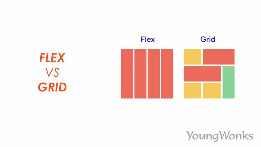
Before diving into comparisons, it's essential to understand what each technology is designed for. Flexbox (Flexible Box Layout) is a one-dimensional layout method for laying out items in rows or columns. CSS Grid Layout is a two-dimensional layout system that handles both rows and columns simultaneously.
Flexbox (1D Layout)
- One-dimensional layout
- Content-driven sizing
- Perfect for components
- Excellent for alignment
- Space distribution
- Responsive by nature
Grid (2D Layout)
- Two-dimensional layout
- Layout-driven sizing
- Ideal for page layouts
- Precise positioning
- Complex arrangements
- Overlap capabilities
When to Use Flexbox
Flexbox shines when you need to arrange items in a single dimension. It's perfect for creating flexible, responsive layouts where you want items to grow, shrink, or distribute space evenly.
Perfect Flexbox Use Cases
- Navigation bars and menus
- Centering content vertically and horizontally
- Creating equal-height columns
- Building responsive card layouts
- Aligning form elements
- Creating flexible sidebar layouts
Flexbox Navigation Example
.navbar {
  display: flex;
  justify-content: space-between;
  align-items: center;
  padding: 1rem;
}

.nav-links {
  display: flex;
  list-style: none;
  gap: 2rem;
}

.nav-links li {
  flex: 1;
}
When to Use CSS Grid
Grid excels at creating complex, two-dimensional layouts. It's the go-to choice when you need precise control over both rows and columns, or when you're building the overall page structure.
Perfect Grid Use Cases
- Overall page layouts (header, sidebar, content, footer)
- Image galleries and portfolios
- Dashboard layouts
- Magazine-style layouts
- Card grids with varying sizes
- Complex responsive layouts
Grid Page Layout Example
.page-layout {
  display: grid;
  grid-template-areas:
    "header header header"
    "sidebar content aside"
    "footer footer footer";
  grid-template-columns: 200px 1fr 200px;
  grid-template-rows: auto 1fr auto;
  min-height: 100vh;
}

.header { grid-area: header; }
.sidebar { grid-area: sidebar; }
.content { grid-area: content; }
.aside { grid-area: aside; }
.footer { grid-area: footer; }
Key Differences Explained
Axis and Dimensionality
The most fundamental difference is dimensionality. Flexbox works along a single axis (either horizontal or vertical), while Grid works with both axes simultaneously. This makes Flexbox ideal for components and Grid perfect for layouts.
Content vs Layout First
Flexbox is content-first, meaning the size of the content determines the layout. Grid is layout-first, where you define the structure and then place content within it. This fundamental difference influences when each should be used.
Flexbox: Content-Driven
.flex-container {
  display: flex;
  flex-wrap: wrap;
}

.flex-item {
  flex: 1 1 300px; /* grow, shrink, basis */
}
Grid: Layout-Driven
.grid-container {
  display: grid;
  grid-template-columns: repeat(auto-fit, minmax(300px, 1fr));
  gap: 2rem;
}
Combining Flexbox and Grid
The most powerful approach is using both technologies together. Use Grid for the overall page layout and Flexbox for the components within each grid area. This combination gives you the best of both worlds.
Combined Approach
/* Grid for page layout */
.page {
  display: grid;
  grid-template-columns: 250px 1fr;
  grid-template-rows: auto 1fr auto;
}

/* Flexbox for component layout */
.header {
  display: flex;
  justify-content: space-between;
  align-items: center;
}

.card {
  display: flex;
  flex-direction: column;
  justify-content: space-between;
}
Performance Considerations
Both Flexbox and Grid are well-optimized by modern browsers, but there are some performance considerations to keep in mind. Grid can be more performance-friendly for complex layouts because it handles positioning calculations more efficiently. However, for simple layouts, the performance difference is negligible.
Browser Support and Fallbacks
Both Flexbox and Grid have excellent browser support in modern browsers. However, if you need to support older browsers, Flexbox has slightly better support than Grid. Always provide appropriate fallbacks for critical layouts.
Progressive Enhancement Strategy
- Start with basic float or inline-block layouts
- Enhance with Flexbox for better alignment
- Add Grid for complex two-dimensional layouts
- Use feature queries (@supports) for safe implementation
Common Mistakes to Avoid
Understanding common pitfalls can save you hours of debugging. Here are the most frequent mistakes developers make when choosing between Flexbox and Grid:
Flexbox Mistakes
- Using Flexbox for overall page layouts (use Grid instead)
- Forgetting to set flex-wrap when needed
- Not understanding flex-shrink behavior
- Overusing flex: 1 without considering content
Grid Mistakes
- Using Grid for simple one-dimensional layouts
- Creating overly complex grid definitions
- Not utilizing grid-template-areas for readability
- Forgetting about implicit grid behavior
Real-World Examples
Let's look at some practical scenarios where the choice between Flexbox and Grid becomes clear:
Example 1: Navigation Bar (Use Flexbox)
A navigation bar needs to distribute items horizontally, with some items aligned left and others right. Flexbox is perfect for this one-dimensional layout challenge.
Example 2: Article Grid (Use Grid)
A blog homepage displaying articles in a grid where some articles span multiple columns or rows requires Grid's two-dimensional capabilities.
Example 3: Card Component (Use Flexbox)
Individual cards with headers, content, and action buttons that need flexible heights and consistent alignment are ideal for Flexbox.
Future of CSS Layouts
CSS continues to evolve, with new features like Container Queries and Subgrid adding even more layout possibilities. However, the fundamental principles of when to use Flexbox versus Grid will remain relevant.
Conclusion
The choice between Flexbox and Grid isn't about which is better—it's about using the right tool for the job. Flexbox excels at one-dimensional layouts and component-level alignment, while Grid is unmatched for complex two-dimensional layouts and overall page structure.
Remember: start with understanding the nature of your layout challenge. Is it primarily one-dimensional? Choose Flexbox. Do you need precise control over both rows and columns? Choose Grid. And don't forget—you can use both together for maximum flexibility and power.
As you continue your CSS journey, practice with both technologies. Build navigation bars with Flexbox, create page layouts with Grid, and combine them for complex interfaces. The more you practice, the more intuitive these decisions will become.